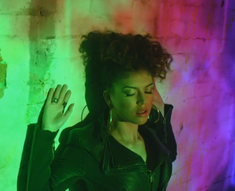
Thursday 31 December 2015

57b. Ancillary Product in Production (digipak)


This shows my development of the inside and outside of my digipak. It shows the process from start to end. It also shows how I edited, for example, how I removed the background from the image or how I changed the opacity. There were also times where I changed my ideas. In one frame you can see a different logo, however when getting feedback from my target audience they said they preferred the first design. 

57a. Ancillary Products in Production (website)

  
This GIF shows my development of my website. As planned, I used the same colour scheme and photos as in my digipak. This allowed my products to have the element of synergy. 

Wednesday 30 December 2015

Ancillary Work: DEVELOPMENT OF LOGO


When creating my logo for my artist, I documented the change of how it started to how my final product looked like. 

Ancillary Work: LOGO


This is the logo I have designed on Photoshop. I created this to use in my ancillary products as it helps creates synergy. I wanted the glow effect as it reminds me of neon lights. which features in the music video and relates to the genre. The colours can also be found in the music video, helping continuity.

Monday 28 December 2015

56. Digital Mock-Up (digipak)


To create synergy with the music video, I want to add a glow effect to the text on the digipak on the front cover.I like how the lines come off some letters, this reminds me of glow sticks or lights like the ones in the music video. However, when doing further research, I found it is important to have an image of the artist on the front cover as it is important for the audience to see the actual artist to form a connection.  Therefore, I also want to add photos to the digipak. I also want to change the colour scheme so it suits the genre more. A present colour in the music video is bright/neon pink. I want to use the same colour for the text as it will help connect the products together. I also think it will look better with the glow effect rather than the red. 

Sunday 27 December 2015

55. Digital Mock-Up (website)

When we started our Advanced Portfolio, we created a website for a selected artist. I chose to do Vince Kidd. Even though it was not our final artist, it gave me the knowledge of what to include on my actual artists website. Even though this is for a different artist, I want to use this as my mock up for Haze's website. 


As she will be a new artist, I want to include as many images of her to gain exposure. This will help her audience recognize her visual style. I also want her name to be in a large font so images and text of her name will be the first thing the auidence sees when entering the site. I also need the links to other pages at the top.  


 Another important feature is to embed the music video onto the homepage. As seen in my previous research, on Karen Harding's original site, she has her music video playing as soon as you enter. This promotes her music. On my mock up, I placed this on a separate page. However, on my final product I want to follow Karen Harding's example and place it on the homepage. 


To help connect with her audience, I want to include links to her social media. This enables her fans to see an insight to her daily life and expand her fan base. 


Wednesday 23 December 2015

Digital Mock up - My initial ideas

 This was the idea that I had for the inside of my digipak, I wanted the lips to be on both the CD and in the digipak behind it. I also wanted some sort of firework display on the right panel but I couldn't do it successfully.
I liked the effect I did with the artists' name as it suited what her name meant and the genre so I am considering keeping that effect. At the time I was editing this, I wasn't quite sure which photo to put behind the text.


For my website, I wanted to keep the layout similar to my practice one I made. The reason is because the text, font and images used are all clear and represent the artist but by talking and showing people of my target audience, I realized that this isn't a convention of my genre. In order to show my genre, I will have to add more colour as the genre is about the artist standing out rather then having a simplistic theme to it.

Haze's costume

Do's and Don'ts of Design work

Powered by emaze

Blogging health check 3


Even though I has initial ideas about my final digipak and website, my decisions are shifting due to the research I am currently doing into digipaks and websites in the same genre. I will be expressing those influences in the following blogs. Also I am trying to use a variety of ICT throughout my research.

Monday 21 December 2015

56. Digital Mock-up - Website Homepage


I created this website as we began our Advanced Portfolio - the task was to create a website for your favourite artist. I chose an up and coming R&B artist, Kehlani. I gathered research on existing artists' websites and created a site in response to that. 
My home page simply consisted of a slide show of professional photographs of the artist - I chose to do this, as it would allow the viewer to recognise her face and recognisable tattoos, along with the website's header of an illustration of Kehlani's face. The overall theme I went was with a simple pink and white theme, to match her most recent release of her mixtape 'You Should Be Here' which has a pink/purple/yellow hue theme. The 'About' page includes a brief biography into the artist along with images I added that shows her front facial profile. The newsletter page was inspired by Ella Eyre's website, where she is able to connect with her fans through newsletters and signing up to the website itself. The 'Music' link included a widget to follow her Spotify, links to her Soundcloud and iTunes that I made. I also embedded some of her Soundcloud track. The 'Video' page begins with her latest single, I embedded the Youtube video larger to promote her mixtape, then I followed with her previous music videos with collaborations and the audios to some of her tracks. The 'Tour' page included a listing of her upcoming tour dates and a button reading 'buy tickets here' directly linking to a site to buy tickets. I had to individually include each product into the 'Store' page, where I included prices, quantity etc. Each product can be added to the user's cart, and the product can be shared on Facebook, Pinterest, and Twitter. For the Contact page, I simply included her record company's name, and an enquiry form, where people may contact the company regarding the artist. I also included an email that was included when trying to contact the actual artist. I believe that the design of this website was successful. This has been measured through visitors of the site actually entering their details into the contact form - one even giving their number asking to contact the artist!


I may consider using the same type of layout for my ancillary product - I will also include the same links within the navigation bar. 


Sunday 20 December 2015

55. Digital Mock-up - Digipak


When pitching ideas to the class, it was required that we created a draft digipak design for our ancillary product. As we did not have of our artist at this time, I had to improvise and find images online. I used Adobe Photoshop to construct these draft images and my process was explained in this previous blog post.

In preparation for the final ancillary product, I plan on using the same technique in order to create the same neon light effect. Alternatively, I will be using one of the selected images of the artist as the focal point of the digipak, as the promotion of our artist must be the primary element. The accent colour may also change to a hot pink colour. 

Thursday 17 December 2015

54. Costumes for Artist (in Ancillary)


For the ancillary we want to focus on having the same outfit as in the music video as this will allow us to help create synergy. We only need close ups for the ancillary, therefore we just want her to wear a white crop top as that is the only thing visible to the camera. We also want the artist to have red lipstick and gold hoops. This is to help create a brand image for our artist. 

Wednesday 16 December 2015

53. Photos for Ancillary


Photos for Ancillary from Martyna Przybycien

Slides 1-10: are the main images I want to use for the front cover of the digipak, I also want to use several images put together to place as a gallery on the website. This allows the audience to see different images of the artist.
    - I am planning on using either Slide 2 or Slide 10 for the front cover, as I like the look on the artists face and think it will blend well with the background images. 

Slides 11-14: are the images I want to use as background photos. I plan on blending them with the images of the artist. However, I also want to use these photos on the inside cover of the digipak, the website and maybe on the CD. As these photos were taken in the same place as a location in the music video, it will help create synergy and will help the audience form similarity between the products.  

54. Costumes


I took screen shots from our music video where all of Haze's costumes are presented. We were aware that a lot of our locations were very colourful and overwhelming so, we decided to avoid patterns and distracting clothing and focused on wearing either black or white to contrast with the setting. The clothing choice was specifically kept simple and 'casual'/relatable to today's teenage audience as they could relate to our artist, expanding her audience. For my ancillary work, the majority of the images were taken at King's Cross, so this includes an off shoulder white top, and white jeans, where the colours of the screens are reflected off.

53. Images to be used for ancillary products


These images are on my shortlist, as we took them during filming, so it would not be completely different to our music video, keeping a reoccurring theme throughout my products. We has a separate photoshoot day, which I think did not go as well, as we had a limited amount of time and the pictures did not come out as planned. When filming at King's cross, the lighting was good and I liked the look of the dominant silhouette of our artist. I have previously edited one of the images for the header of our blog - I may choose another image to avoid repetition in design.

Tuesday 15 December 2015

56. Digital mock-up of ancillary task 2 - Website


This is my digital mock up for my actual website. I had created this website during the beginning of the advanced portfolio work. The task was to create a website for an artist - For this I chose the grime artist Skepta. I firstly looked at genre convention for other grime artist, for example, the colour scheme which was predominately dark colours such as black, grey, blue.
Also, as the main purpose of a website is to promote the artist I had a gallery of pictures of Skepta and on the music page I had embedded videos from his latest singles. I had also created an 'About' page so Skepta's fans can get to know more about him. Finally, the last few pages I had completed were tour dates and merchandise. All of this together helps promote Skepta artist.

I am planning to use the same layout for my ancillary products. However, as our artistt Haze is a House / R&B artist and isn't a grime artist I will change elements such as the colour scheme to suit Haze's genre conventions.

Blogging Health Check 3

Mark: 18
Grade: A*
"68 posts at final health check.  Excellent blog Shannon - well done.  The blogs detailing the filming and editing process are excellent - lovely reflection and sense of a journey.  I like that you are still individually posting too. 
There is plenty of evidence for a high A grade here.  As we move into the final stages of the blogging ensure that you do the following:
1. Post all research and planning for the ancillary in the right order.
2. Provide some evidence of the construction process - you will be doing much of this at home and so this is really important for Dan and I to get a sense of the building of your Wix and creation of your digipak.
Keep up the excellent work."


In response to this feedback, I have been posting my research and planning for my ancillary work. I will also be showing evidence of the construction of my products.


55. Digital mock up of ancillary task 1- Digipak


Here is a digital mock up only my front panel. I have so far chosen the picture I am going to use and the placement. However, I think I will move the picture more towards the right as i do not like the placement of the text. I plan on making my background to a red/pink background in synergy the music. Also, I will put an overlay of blurred lights to also create a synergy with the blurred lights used in the music video. Additionally, I plan using a glow effect on the text to create the effect of light to connote a light motif which is used in the music video. Also, because the name of the album is AFRERGLOW. 

Monday 14 December 2015

52. 'Dos' and 'Don'ts'


canva

Summary of importance and function of digipaks in the music industry

52. Do's and Dont's of Design Work

Powered by emaze

Where my ideas came from?

Photos that may be used in ancillary work


Ancillary pics - Kizoa Online Movie Maker

These images are the ones I plan to include in my Digipak and website.

50. DESIGN IDEAS (FONTS, COLOURS, LAYOUTS)


As a group, we all decided on a similar font style and colour scheme. We are looking to incorporate the use of the colour pink. We liked this as it had a strong presence in our music video. This will show our music video and our products to have synergy. The neon pink is bright, we also want to add an effect which makes the text glow (like our location of the light shop). This allows the audience to see similarity. It also sets the genre of our artist, dance/pop. The lights and neon colours represent this genre well. 


FLAT PLANS:


These are the flat plans I created for my ancillary product. I used colour to indicate what I want and how the products will link together. For example, I used orange to show the background, both products will have the same background image. 

54. Costumes

Costume 1


Costume 1 consisted of:
A black leather jacket
Black top
Black Jeans
Hoop earring + red lipstick

The background of most of our shots were very colourful and bright. So, decided that our costumes should be simple in terms of colour. Therefore, this costume was black in order to not clash with the background. However, our outfit still matches genre conventions, for example, in Karen Harding's Say something video she also wears a black jacket and hoop earrings.  Similar outfits are featured in music videos of the same genre.
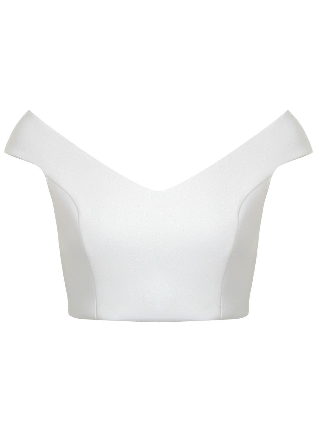


Costume 2 


Costume 2 consisted of:
White off the shoulder top
White jeans
Hoop earring + red lipstick

Though this outfit does not follow genre conventions we chose this outfit specifically in order to suit out location. Our location for this outfit was the King cross tunnel which features a back-lit colourful LED wall which runs throughout the tunnel. Therefore, we chose the white outfit in order to reflect the light of the tunnel onto the outfit as this would of not of worked with a black or dark outfit. 


Costume 3


Costume 3 is very similar to Costume 1 the only difference is that out artist Haze wears a black bomber jacket rather than the a black leather jacket. Again, this outfit was used to match genre conventions and was used as a contrast to the background. Also, these outfits are similar to what our target audience of 16-20 somethingsfemales would wear as these outfits are very casual and  relatable. This would then thus allow our audience to connect with her target audience.

53. Photos I plan to use in my ancillary work


I have chosen these particular images because they are generally clear and well lit.

52. The 'Do's and 'Don't's' of design work

51. My ideas/Existing ancillary products

Saturday 12 December 2015

Wednesday 9 December 2015

Cinema Feedback

practicing using photoshop

At this stage, I was getting use to the idea of cutting the main image (the women) from the background and separating them both. There are special tools that make this process easier. In this example, I used the 'quick selection' tool over her outline by clicking and dragging it around her.


At this stage, I learnt how to take the image of the women and place her on another background, this is particularly important as when I do my digipak, I may need to add my image over a different background. 


In a media workshop, I was practicing how to use photoshop. Especially blending an image and cutting them out.