4. Shannon, Martyna, Rhiana, Esther from 283goswellg on Vimeo.

H A Z E
Showing posts with label Martyna Przybycien. Show all posts
Showing posts with label Martyna Przybycien. Show all posts
Tuesday, 12 January 2016

Monday, 11 January 2016
EVALUATION: Question 2
HOW EFFECTIVE IS THE COMBINATION OF YOUR MAIN PRODUCT (VIDEO) AND ANCILLARY TEXTS (DIGIPAK & BAND WEBSITE)?

Overall, I think the combination of the main product and ancillary texts are very effective. This is because the artist has the same look in all three products, the same location features in them and the colour scheme remains the same. These features allow the audience to form a link between the products and notice that they are linked together. This enables my products to have synergy which helps them be more effective. If my video remained the same but when creating the ancillary products, I would have created a black and white theme, the audience would get confused as there is no element of black and white in my main product. Therefore for all the products to be successful, I believe they need to have the same or similar features as this helps the audience form a link.
EVALUATION: Question 3
HOW DID YOU USE MEDIA TECHNOLOGIES IN THE CONSTRUCTION AND RESEARCH, PLANNING AND EVALUATION STAGES?

Sunday, 3 January 2016
Reflection on Progress (Blogging Health Check 3)

Since my last blogging health check, I have moved up a grade. My blogging mainly focused on planning our music video, showing our different ideas. There are also posts showing filming in all our locations and getting feedback from different audience members about how we could improve our music video even more.
Saturday, 2 January 2016
59. Completed Ancillary Products (Digipak & Website)


These are the inside and outside covers of my digipak. As you can see I have used similar colours, images and texts to help create synergy.
http://martynaprzybycien.wix.com/haze And here is the link to the website I created. Again, I wanted to continue the same visual style as in the digipak. This will allows the audience to see a connection between the two products.
Friday, 1 January 2016
58. Feedback on Ancillary Products
WEBSITE
http://surveynuts.com/surveys/take?id=52041&c=592642925RJVP
This is the survey I created so my audience would be able to go on it and take the survey regarding my website. This allowed me to get live feedback from the audience themselves.
MY RESULTS SHOWED:


DIGIPAK
After completing my digipak, I asked my target audience what they thought about my final outcome. These are the responses I got :
http://surveynuts.com/surveys/take?id=52041&c=592642925RJVP
This is the survey I created so my audience would be able to go on it and take the survey regarding my website. This allowed me to get live feedback from the audience themselves.
MY RESULTS SHOWED:


DIGIPAK
After completing my digipak, I asked my target audience what they thought about my final outcome. These are the responses I got :
Thursday, 31 December 2015
57b. Ancillary Product in Production (digipak)

This shows my development of the inside and outside of my digipak. It shows the process from start to end. It also shows how I edited, for example, how I removed the background from the image or how I changed the opacity. There were also times where I changed my ideas. In one frame you can see a different logo, however when getting feedback from my target audience they said they preferred the first design.
57a. Ancillary Products in Production (website)

This GIF shows my development of my website. As planned, I used the same colour scheme and photos as in my digipak. This allowed my products to have the element of synergy.
Wednesday, 30 December 2015
Ancillary Work: DEVELOPMENT OF LOGO
When creating my logo for my artist, I documented the change of how it started to how my final product looked like.
Ancillary Work: LOGO

This is the logo I have designed on Photoshop. I created this to use in my ancillary products as it helps creates synergy. I wanted the glow effect as it reminds me of neon lights. which features in the music video and relates to the genre. The colours can also be found in the music video, helping continuity.
Monday, 28 December 2015
56. Digital Mock-Up (digipak)


To create synergy with the music video, I want to add a glow effect to the text on the digipak on the front cover.I like how the lines come off some letters, this reminds me of glow sticks or lights like the ones in the music video. However, when doing further research, I found it is important to have an image of the artist on the front cover as it is important for the audience to see the actual artist to form a connection. Therefore, I also want to add photos to the digipak. I also want to change the colour scheme so it suits the genre more. A present colour in the music video is bright/neon pink. I want to use the same colour for the text as it will help connect the products together. I also think it will look better with the glow effect rather than the red.
Sunday, 27 December 2015
55. Digital Mock-Up (website)
When we started our Advanced Portfolio, we created a website for a selected artist. I chose to do Vince Kidd. Even though it was not our final artist, it gave me the knowledge of what to include on my actual artists website. Even though this is for a different artist, I want to use this as my mock up for Haze's website.

As she will be a new artist, I want to include as many images of her to gain exposure. This will help her audience recognize her visual style. I also want her name to be in a large font so images and text of her name will be the first thing the auidence sees when entering the site. I also need the links to other pages at the top.

Another important feature is to embed the music video onto the homepage. As seen in my previous research, on Karen Harding's original site, she has her music video playing as soon as you enter. This promotes her music. On my mock up, I placed this on a separate page. However, on my final product I want to follow Karen Harding's example and place it on the homepage.

To help connect with her audience, I want to include links to her social media. This enables her fans to see an insight to her daily life and expand her fan base.
Thursday, 17 December 2015
54. Costumes for Artist (in Ancillary)
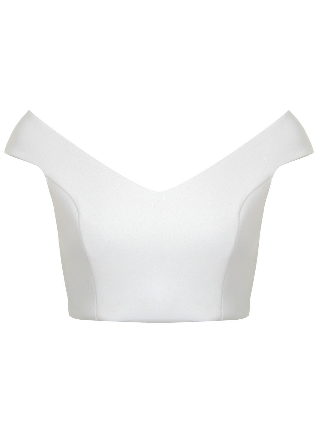
For the ancillary we want to focus on having the same outfit as in the music video as this will allow us to help create synergy. We only need close ups for the ancillary, therefore we just want her to wear a white crop top as that is the only thing visible to the camera. We also want the artist to have red lipstick and gold hoops. This is to help create a brand image for our artist.
Wednesday, 16 December 2015
53. Photos for Ancillary
Photos for Ancillary from Martyna Przybycien
Slides 1-10: are the main images I want to use for the front cover of the digipak, I also want to use several images put together to place as a gallery on the website. This allows the audience to see different images of the artist.
- I am planning on using either Slide 2 or Slide 10 for the front cover, as I like the look on the artists face and think it will blend well with the background images.
Slides 11-14: are the images I want to use as background photos. I plan on blending them with the images of the artist. However, I also want to use these photos on the inside cover of the digipak, the website and maybe on the CD. As these photos were taken in the same place as a location in the music video, it will help create synergy and will help the audience form similarity between the products.
Slides 1-10: are the main images I want to use for the front cover of the digipak, I also want to use several images put together to place as a gallery on the website. This allows the audience to see different images of the artist.
- I am planning on using either Slide 2 or Slide 10 for the front cover, as I like the look on the artists face and think it will blend well with the background images.
Slides 11-14: are the images I want to use as background photos. I plan on blending them with the images of the artist. However, I also want to use these photos on the inside cover of the digipak, the website and maybe on the CD. As these photos were taken in the same place as a location in the music video, it will help create synergy and will help the audience form similarity between the products.
Monday, 14 December 2015
50. DESIGN IDEAS (FONTS, COLOURS, LAYOUTS)

As a group, we all decided on a similar font style and colour scheme. We are looking to incorporate the use of the colour pink. We liked this as it had a strong presence in our music video. This will show our music video and our products to have synergy. The neon pink is bright, we also want to add an effect which makes the text glow (like our location of the light shop). This allows the audience to see similarity. It also sets the genre of our artist, dance/pop. The lights and neon colours represent this genre well.
FLAT PLANS:


FLAT PLANS:


These are the flat plans I created for my ancillary product. I used colour to indicate what I want and how the products will link together. For example, I used orange to show the background, both products will have the same background image.
Saturday, 12 December 2015
Monday, 7 December 2015


Subscribe to:
Posts (Atom)