Friday, 22 January 2016
Wednesday, 20 January 2016
Evaluation Question 2.
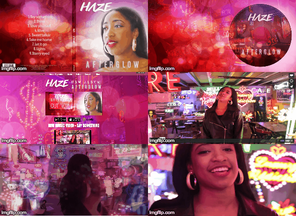
The audience can recognise my ancillary texts as linked products due to the same backgrounds, colours, and images I used across all my ancillary products.
I think my main and ancillary texts are very successful because you can see they are clearly linked together with synergy and have a clear relation with the music video. Also, I think the design of my media products are well suited to Haze's target audience.
I think my target audience will be attracted to them because Haze's target audience are young females around the ages of 16-24 from urban areas. Firstly, I think the main colour of red and pink will be deemed attractive by the female audience. Also, I think the audience will like elements of Haze's costume such as hoop earrings, bomber/leather jacket as these are items similar to what our audience would wear.
As you can see from the gif of Jess Glynne's digipak, music video, and website you can clearly see her use of synergy. For example, the pale pink background exhibits in throughout all her media products. I have done the same with my media products by using similar backgrounds. Jess Glynne's music shows her with wet hair. This again is incorporated across all her media products such as her website and digipak. I have done something similar by incorporating Haze's hoop earrings and signature red lip from the music video across my media products such as my digipak and website.
Tuesday, 19 January 2016
Monday, 18 January 2016
Final finished digipak
The top photo is the outside of my finished Digipak. I am pleased with it especially because i was able to flip the image and give it the colours that were part of my synergy. It also links with the music video well because that looks like one of the locations that was used. The inside also links well as the layers behind were from another location and also has a 'haze' affect.
Wednesday, 13 January 2016
Subscribe to:
Comments (Atom)


